Rebecca Morris: Rose Cut
- Rebecca Morris in conversation with Kate MacNamara, Summer 2015
Conducted on the occasion of Rebecca Morris’s solo exhibition at 356 Mission.
Kate MacNamara: Can you tell me about the title of your exhibition, Rose Cut?
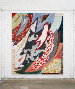
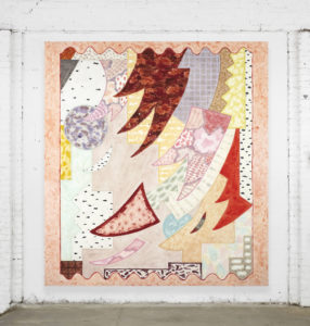
Rebecca Morris: “Rose Cut” as a show title was rolling around in my thoughts the past couple of years. And this show seemed right because of the big salmon-pink-red colored painting (Untitled #04-15) that is included and some of the paintings that led to it. A rose cut is a particular cut of diamond, an older classic. It has a nice symmetrical geometric structure that I like. My engagement ring is this cut so I look and see it daily – a round half circle divided into equally shaped triangular facets, like a geodesic dome on my finger. I also love the scent of a rose and am really drawn to perfumes that are rose based, which is a huge world of fragrance. So I was thinking about the perfume aspect in using the word rose as well. And that perhaps the lightness/ thinness of the paint handling I use, could communicate an aspect of scent as much as the color relationships might create an attitude. All of this might be going out on a limb, but I like thinking about this idea, if not just for myself. Did I tell you the story from my 11th grade of high school year where a friend and I started The Mauve Club of America?
KM: Um, no. Please tell me everything about The Mauve Club of America! I actually have a distinct memory of first encountering the word Mauve.
RM: I started a new school for my junior year of high school in Hamden, CT in 1985. It was sort of an awful year. There were probably three best parts of that time and one of them was the quasi club I started with my 10th grade friend, J.R. We called it “The Mauve Club of America”, pronounced Mow-ve, not Maw-ve and we made cards for our members on the backs of business card shaped Formica samples in the color Mauve. The lettering was classic rounded Apple computer font. I don’t think we ever held meetings or anything; we just made the cards and talked about it on the bus to and from school. It was all admin.
I was thinking of all of this recently because I have been using a lot of mauve or mauve generated colors in paintings during the last few years. I wasn’t calling it mauve so it took me a bit to reconnect to my 11th grade interest. I was calling it “dirty ballet shoe pink”, “the color of used chewed gum”, “a particular bad kind of rose”, “artificial guava”. But it’s all a version of mauve. Barbara Weiss, my art dealer in Berlin, has a beautiful gallery bathroom in a warm earthy mauve. It is impossible to photograph the color in there. I had the opportunity to meet the architect and he said the color was “four kinds of powder”. This really stuck in my head. In any case I think the color gets a bad rep and poses some color problems that I am interested in.
What is your Mauve story!
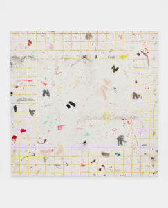
KM: That is too funny and a perfect circle. You had a thing for mauve before you knew how to articulate or engage with it! My uncle worked for Revlon makeup in the late eighties/early nineties. I remember for Christmas one year he sent this incredible Revlon makeup kit that had every powdered eye shadow, lipstick and nail polish they had produced up until then, each labeled with the color name. You would have loved it. It was both overwhelming and the most exciting gift a ten year old could receive. I distinctly recall stumbling across the eye shadow color mauve – pale, earthy, some hints of purple and brown – “dirty ballet shoe pink” is a great description. I could not figure out how to say it and after rolling over the possible ways to pronounce mauve, I settled on Mwave. Mwave. So weird. Not that there were so many opportunities to use the word, but I am pretty sure it was only like 15 years ago that I realized I was absolutely mispronouncing it. I like the suggestion that the color is “four kinds of powder” – it’s kind of a radical color, isn’t it? A certain elusive relationship to distinction – its ambiguity is powerful. I was thinking about your use of these kinds of colors and a certain relationship to form and surface. In Untitled (#TBD-15), 2015, there is this relationship between the foreground and background that gets amplified by a thinness or quality of reduction that you achieve in these new paintings. There are these washed out and brushy moments, which demonstrate an evocative quality of abstraction, one that is more premeditated and closely monitored.
RM: This is a fantastic story! I really like mauve for this exact reason: its elusiveness. It has an in-between-ness I like. I read an article recently about the interior decorator, Bunny Williams, who sited mauve by saying, “The most unappetizing color for a dining room is: mauve. I don’t like teal either, but mauve is worse.” I of course wanted a mauve dining room at once!
KM: We spent the best day going through the incredible Native American beadwork show at the Autry Museum together this spring – Floral Journey: Native North American Beadwork. We were both so blown away by the intricate designs, the unbelievable craft and skill, and beautiful materials. The show led to many different conversations, including the role and definition of motif. Do you feel like the word motif applies to the way in which you are thinking about composition?
RM: That was a remarkable show. I think I use specific forms of composition as a kind of device. Sometimes it feels more ornamental than others. Be it through the borders I make in the paintings or ways I will use elements at the edge of the picture plane to frame. It’s a tool to give structure to the smaller parts inside the paintings and gives these areas a backbone/ an organizational structure.
In “Rose Cut” there are two large-scale paintings from a compositional refrain that I casually call the Lobster Claw. These two paintings (Untitled #04-15 and Untitled #13-15, both this year) and the two before them (Untitled #15-13, 2013 and Untitled 01-06, 2006) and one other wasn’t quite a Lobster Claw yet but shows the beginnings (Untitled, 2003) are the closest thing to a series I have made. I differentiate this to other paintings that may have felt similar to each other in certain compositional ways, but that were ultimately autonomous and not part of a discrete kind of continuum. These works may have had repeated elements but were creating an unfixed alphabet. But with these Lobster Claw paintings I am aware of a desire that they be connected to each other and to reference the others. Maybe a Leitmotif?
KM: Is there a process of looking that informs your making?
RM: I paint with the works flat on the floor and then they need to come up so I can look at them. This looking time varies greatly. Sometimes I know immediately what to do next, or that something needs to shift. Other times I have to think for a few days. Occasionally I need to think about a painting for much longer. It becomes a time-out. When this happens it can be a bit nerve wracking and/or frustrating and/or a bummer because I start to wonder if I’ve lost the painting, or am losing “it” myself. But in the end several of these pieces have been what I later see as very strong works. I hate rushing the looking part. There was one year where there was way more looking than making, maybe it was 2011? I just had to trust that this was okay and was a natural, but important shift.
KM: The scale of your work keeps getting bigger – it feels like an obvious accommodation considering the complexity of composition, but I think it also speaks to a certain corporeal relationship to the viewer. Can you speak to this at all?
RM: Truth be told, I was thinking more about myself, the artist, than the viewer when I increased the scale. In early 2012 I moved studios so I could work at a larger size (106 x 80.5” was the largest I could go at the old one and I knew this size well). Moving to a scale where I couldn’t see the entire painting anymore while I worked and couldn’t even carry a controllable straight line or good looking large curve interested me and I knew it would throw me off in a good way. I joke that changing scales dramatically within a tight time frame is a kind of studio cross training. Also going to a markedly large scale was something I had not done yet and I wanted to follow through on that. And, as you say, certain painting ideas were taking me there too. And when you get to a certain point as an artist it’s really important to find the things you are not doing and do them—whether you exhibit them or not. Thankfully I have had the opportunities to make work at this scale and show it. But getting back to the effect on the viewer, I have always been interested in creating a dynamic presence for the viewer via specific forms, color palette, texture. All of these things together. Scale is just another piece of that.
KM: Last question! What have you been listening to in the studio lately?
RM: The last few months I have not been listening to music that much in my studio. A strange period of needed silence? Before this time out I was listening to TVOTR’s latest album and some favorite mix CDs my friend Michelle makes for me. She is very good at this. John Corbett of my gallery in Chicago, Corbett vs Dempsey, has made me some terrific mixes that I count on too. A recent one has this great great song by Felix Kubin, “Hit Me Provider”.
Kate MacNamara is the Otis College Director of Galleries and Exhibitions, and is a co-founder of the art space Cleopatra’s
- Select Reviews
-
Hamza Walker: “Rebecca Morris and the Revenge of P&D”
October 15, 2015


