Becca Albee
- Becca Albee interviewed by Matt Wolf, January 2015
Matt Wolf: What’s your favorite color?
Becca Albee: Well the first color choice I remember making was the combination of light pink and kelly green.
MW: Where did that combo come from?
BA: When I was in first grade I chose to have my bedroom carpet green and the walls painted pink. I thought of the carpet like grass. I think I got the idea of the combination from The Preppy Handbook, this old satirical how-to book about being preppy that my brother had, emphasizing the pink and green color combination.
MW: So did you wear those colors?
BA: No. I ended up using pink as a way to feel calm. I’d stare at my pink bedroom walls.
MW: And did pink follow you?
BA: My first apartment in Olympia (Washington) was pink. It was already painted that color, and I left it that way. I have continued to find myself in more pink rooms.
MW: So how did you get started on thinking about color and feelings?
BA: Last January I was in Oakland at a residency (at Real Time & Space) and I got an email from my dad telling me I should go see a WPA mural by Hilaire Hiler that my parents’ friend Anne Rosenthal had recently restored.
MW: What kind of mural is it?
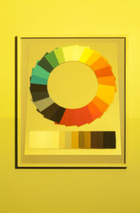
BA: There are actually two full-room murals by Hiler. One re-imagines Atlantis. The other one is a huge color wheel.
MW: When were they made?
BA: They’re New Deal murals completed in 1939. While I was in the Bay area I was researching materials from the 1920s and 30s, and the fact that they were from a similar period was interesting to me. So I went to look at them.
MW: Where is the color-wheel mural?
BA: It’s in the Aquatic Park Bathhouse in San Francisco. The building is shaped like a streamlined ship and it is on the water in San Francisco, across the street from the Ghirardelli Chocolate Factory. The color wheel is on the ceiling of a circular room that Hiler called the Prismatarium. The building is now the San Francisco Maritime Museum and is also a senior center. The day I visited there was a hula lesson taking place in the Prismatarium.
MW: Wow, amazing!
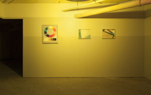
BA: I know. The room is really impressive. It contains Hiler’s Psychological Color Chart with 190 colors, and the walls are painted in dark-to-light bands of grey that wrap around the circular room. His color wheel included pigments found in nature and the observed human reactions to them. The painting and other details in the room are striking, but they’re a bit obscured by an abundance of tables and chairs, hand-drawn posters, puzzles, and a piano. I thought it would be more like a museum, but when I visited it was a multipurpose room for a variety of senior center activities.
MW: What was the Prismatarium originally used for?
BA: It was the ladies’ lounge. The Aquatic Park building and the numerous WPA projects were being planned concomitantly, so the architecture considers the artwork and vice versa.
MW: What is Hiler’s story?
BA: He was an American artist with an eclectic background; born Hiler Harzberg but his father changed the family name to “Hiler,” so he then had to change his first name. He studied briefly at RISD and also Wharton but finished neither, ended up moving to Paris and was a staple there in the 1920s and 30s, until he moved to San Francisco. In Paris he was a painter, color theorist and studied to be a psychoanalyst. He was also a musician, and he ran a nightclub. I’ve learned a lot of information about Hiler from his friends; writers such as Henry Miller and Anaïs Nin wrote about Hiler. He was discussed quite a bit by his peers.
MW: What did they write about him?
BA: That he was a likeable character—outgoing, big, eccentric, and obsessed with color. There are peculiar things, like he was really self-conscious and got plastic surgery to reduce the size of his ears, and he often played piano with a monkey on his back.
MW: So he made kind of abstract work informed by his theories on color?
BA: Yes, but not initially. It seems like the Prismatarium was a turning point in his work. After that his work was driven by his theories on color and were given descriptive titles explaining his method and formula. Shortly after completing the Aquatic Park Bathhouse project he ended up moving to Los Angeles, and Schindler made a house for him that no longer exists. He started a color school, moved it to Santa Fe, moved back to LA, and then ended up back in Paris. He wrote a lot about costumes, art, and color.
MW: If you could summarize, what was his color theory?
BA: He wrote and published quite a bit about color and psychology, and it changed over time, sometimes even contradicting previous texts. In an early manifesto, he wrote that there needed to be a move away from thinking about color as a problem of physics and toward thinking about color as psychology; about being in touch with the intuitive and the present-mindfulness of creating and experiencing color and recognizing the associative psychology of color. If writing in an art context, he would emphasize the importance of psychology, and vice-versa when publishing in a psychology context. He wrote that psychologists should be trained experts on color.
MW: So he was blending his art and psychoanalysis backgrounds?
BA: Exactly. And so the Prismatarium presents his color wheel. I heard he believed that color is optimally viewed with a foundation of a twelve grey gradient. But the room doesn’t reflect his plan—in parts of the room there are only 3 bands, and it is suspected that they were painted when the WPA artists were on strike. Also, Hiler’s primaries were not blue, red, and yellow. In his book Color Harmony and Pigments he dismissively refers to these colors as the “so-called primaries.” His primaries were cyan, magenta and yellow, which as a photographer was really interesting to me. And in the plans for Hiler’s Prismatarium he described a cyan, magenta, and yellow light fixture rotating in the center of the room. The light would dynamically project those colors onto the color wheel so that you could experience the “vibrations” or the “spectacle” of the combining colors. But there is no evidence of this light fixture and it is suspected that the planned fixture was never actually made.
MW: And what was the desired effect of that spectacle?
BA: The reason it’s called a Prismatarium is that he really wanted people to have a higher appreciation and connect with color, like in a planetarium how you connect with outer space or the heavens.
MW: Do you know who went there?
BA: The Prismatarium was the ladies lounge, a women-only space. In his proposal, Hiler justified making the mural for only women to see because “everybody knows that the fairer sex has a higher connection to color” or something.
MW: So what were women supposed to do in the space?
BA: I wanted to find historical photographs of the ladies lounging. I don’t really know, but I assume it was a place where women hung out, the typical kind of separated space at that time. I fantasize that it was a place of radical feminist activities, plotting, planning and healing.
MW: And so how did entering into this space and learning about Hiler and his theories inspire you?
BA: When I went back to photograph the Prismatarium, a glee club practice was taking place. The instructor stopped mid-song and asked, “Why are you photographing this room?” And I was like, “Oh, because I’m interested in the mural.” And she’s like, “Yeah, so what is this room anyway?” People who use it all the time don’t even know what its original purpose was or about the artist who designed this striking space. The glee club instructor then stopped because she received a text that was a photograph from her daughter who had just gotten a makeover. She asked me how to access the photo so she could show her daughter’s photo to the class, so I showed her. She showed the class, and then they started singing again, and I continued to photograph.
MW: So the people using the room didn’t necessarily know what these colors were for, but there was this subliminal effect of color in this space?
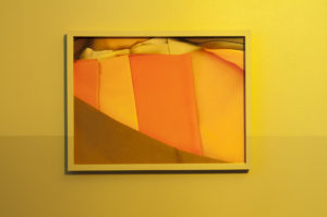
BA: Yes. The room was so well planned and harmonious that it actually makes sense that it was just accepted and not questioned. After that experience I started thinking about other practices or forgotten movements where someone tells you prescriptively how color is supposed to function in our lives. I remembered that when I was young my neighbor was a colorist—she told women what to wear based on the seasons. You are a season, an autumn, a spring, a summer, or a winter. At the end of your consultation with the colorist, you’d leave your consultation with a checkbook-size wallet of swatches, which you were supposed to carry with you for reference when you’re shopping, to color match the clothing with the swatches and to not stray from the colors provided for your season. That system of color matching was so interesting to me, specifically the kind of authorship involved in prescribing colors for other people.
MW: It’s more color therapy than color theory, isn’t it?
BA: Yes, and color consultation. It was a part of a group of systems made popular by Color Me Beautiful in the early eighties.
MW: What is that?
BA: It’s an awful name, but that’s what it was called. It was a color-reading practice that I thought was a brief fad for my mom’s generation that had since disappeared. When I went to Dublin for a residency at the Irish Museum of Modern Art last summer, I brought an old consultation swatch book because I was interested in it as material, and on my first day there I walked past a Colour Me Beautiful shop! That was a mind-blowing thing —Colour Me Beautiful still existed. I went back to the shop and got my colors done by a practicing colorist who was trained in the 1980s.
MW: And what did she say to you based on your color reading?
BA: I thought I’d go there and it would be a bit like therapy. I figured I was going to talk about my feelings or something. But it turned out I was supposed to be passive; it was more like going to the gynecologist.
MW: What did they do to you?
BA: She put colors on me to tell me what colors I should and shouldn’t wear and why. I was seated in front of a mirror watching all these color drapes go on and off, but I didn’t really get to say anything, just “uh huh.” And she would say things like “Be careful of the mint,” or “Blues are your enemy camp.” There were casual mentions of which colors would make me feel younger or look more expensive. It was like a choreographed magic trick, a sleight of hand. Afterward I didn’t quite know what to think but I left with a swatch book containing my colors.
MW: Are there other kinds of color therapies or readings like that?
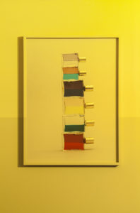
BA: During a studio visit in Dublin I learned about Aura Soma. You go to someone who’s also called a colorist, but in this case you pick out bottles containing dual-colored essential oils and mineral water called Equilibriums. The displays are like a perfume display you’d find at Sephora and are not marketed with the expected new age branding. Yet the process is like tarot reading, because you pick out four bottles (which cost $65 each), and the colorist tells you what your selection means based on the color combinations. You then use them by shaking them, looking at them, wearing them, and even photographing them. Since then I’ve been collecting these color-therapy stories, and I continue learning of more.
MW: You’re sort of tracing a history of color therapy that’s outside the discourse of art. These movements are more involved with feelings than with optics, and they’re mostly marketed to women.
BA: Well, I’m interested in the subjectivity of color, and the idea of color being used for healing. I do think that Hiler had this idea of color being a solution for humans. I also have an interest in those things that make us feel better. So there is this aspect of wanting to explore what it means to create a restorative space. I am intrigued by the convictions of people who believe they’ve found a system to create that sort of harmony, and by non-hierarchical forms of healing.
- Select ReviewsPast Press


