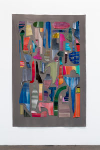
Katy Fischer: Finders, Keepers, Lovers and Weepers
- Katy Fischer in conversation with Laura Owens, March 2015
Laura Owens: So you sent me these pictures that you put into groups of three, do you want to talk about what it is we’re looking at?
Katy Fischer: The first theme is swatches, tests or sketches; they’re all provisional things. This is a Turner watercolor test from his sketchbook. It was never meant to be seen, it was just this little….
LO: Pre-painting painting.
KF: Yes!
LO: What’s this second thing? That looks really interesting.
KF: The second thing is a kimono swatch book.
LO: Those are pasted in?
KF: Yes. These are little samples of kimono fabrics that are pasted into the book. I like how the way the scraps are cut out and glued into the book creates an unintentional kind of composition. And this one is a little Sonia Delaunay test sketch for a fabric design.
LO: The kimono swatch looks like it maybe influenced you because of the way that the shapes get made, they’re not just the hand, they’re not cut, they’re somewhere between cut and stretched and painted. Were you thinking about these at all? Or do you think it’s the reason you like them?
KF: I think it’s the reason I like them, these are really nice stand-ins for all the other swatches that I’ve ever loved.

J.M.W. Turner, Colour Trials from the Bristol and Malmesbury Sketchbook, 1791. Watercolor on paper, 7 ¼ x 10 1/3 in

1930s Japanese YUZEN Dyeing Kimono Sample Book
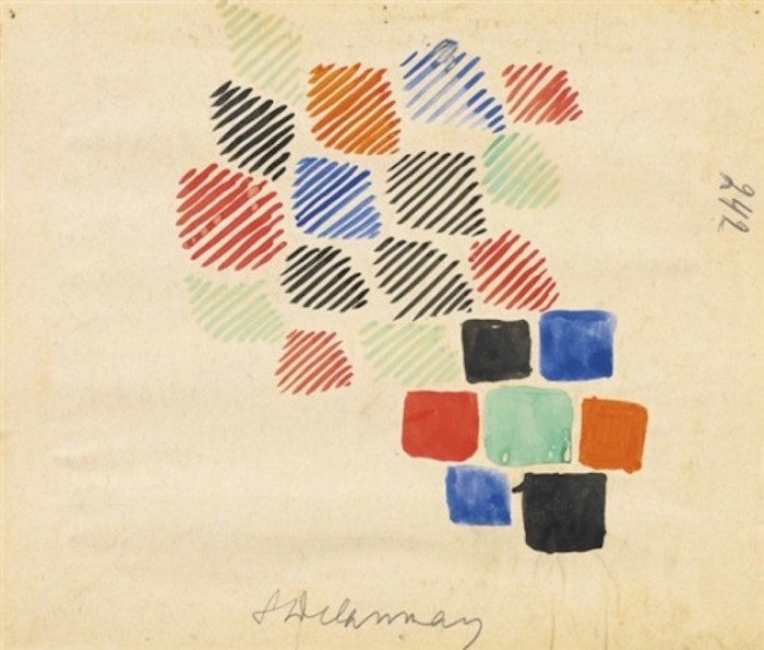
Sonia Delaunay, PROJET DE TISSU, 1928. Watercolor on paper affixed to card, 8 x 9 5/8 in
LO: What do you think it means to make art out of things that maybe reference a remnant or a scrap instead of a whole?
KF: The thing I like about them is the genuine feeling of serendipity, the feeling that the composition happened really fast and somewhat arbitrarily. So much of the shape is determined by accident, by the way that it happened to be cut. I am attracted to how, as samples of repeat fabrics, the clippings are meant to demonstrate what the overall pattern looks like, how one would strive to make the most minimal cut that still conveys the idea without wasting too much of the fabric. I think that economy is part of what is so exciting for me about these. When I was teaching block printing on fabric and screenprinting with dyes at Textile Arts Center I was making a lot of swatch books.
LO: For yourself? Or with the students?
KF: Yeah, in order to demonstrate different techniques for the students, I would make a lot of little swatches and cut them out and pin them onto paper. I always liked them better than the finished repeat fabrics I made.
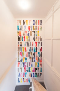
LO: Do you feel like that led to the big installation you have in the stairwell that’s cut shapes of painted fabric?
KF: It did lead to those, yeah. I’ve worked with collage and cut things on paper for almost ten years. So I’m always working with the idea that things can be modular, that the components can move around and that they always flirt with the line between being a scrap and a thing.
LO: Because scrap implies leftover from the real project. So what is it to make art out of something that’s discarded?
KF: Or is it discarded? We always assign an arbitrary kind of value to shapes. We say, “That’s the thing and that’s the leftover.” Those labels are based on all kinds of subjective decisions. I am always looking for shapes that are right on the line between a form and a scrap because difference between the two is pretty abstract. Why is this thing a thing and this thing not a thing? Everything’s a thing!
LO: Do you throw a lot of things away?
KF: I do (laughs). Yeah.
LO: So there’s a real valuation, evaluation process going on when you’re looking at a things you make in the studio.
KF: There’s a lot that ends up on the floor and that pile is always really great, but the ones I keep just have to feel like they’re done. Like they have autonomy, they have to feel like an individual to be finished. Like how in the kimono scrap book, each one is functioning and it’s finished. It’s the finished swatch. And as a whole they make a nice composition and as a whole they’re functioning as a book of scraps to select from, so in terms of how they’re supposed to function there’re working. The same thing happens in the studio, getting the elements to function, getting them to fulfill their role as things. Once they do, then they get sorted into the finished pile and the other pile just keeps getting worked. And that sorting and sifting is a thing I want to keep in the work, I don’t want that to be hidden, I want it to stay.
LO: But in your mind is there always a possibility that these things will get grouped so their autonomy can be reliant on a kind of compositional grouping that you then choose at another point in time?
KF: Yes. They hang out together, but I never quite see them as totally melding. They way family members are still individuals despite being grouped as a family. For example, if we go onto the next image set, the next set are things that have this negative space around them that defines them as a collection or as a taxonomy of things that are grouped together.
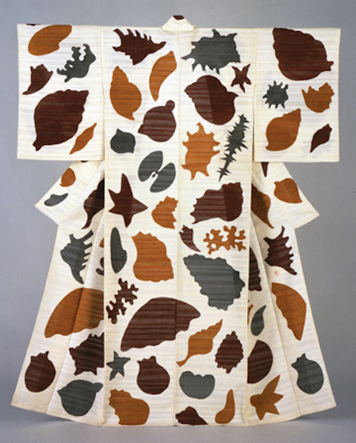
Serizawa Keisuke, Seashells, 1963, kimono, stencil-dyed silk gauze 623/4×511/8in.
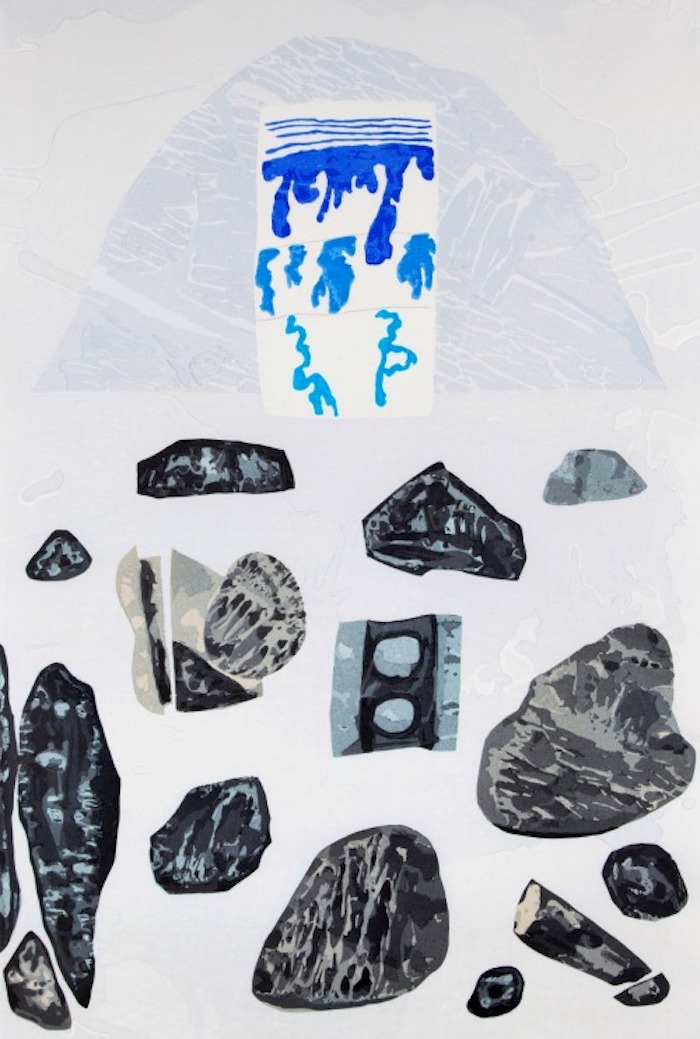
William Brice, Kyoto, 1987. Color woodblock print, 19 blocks, 7 colors
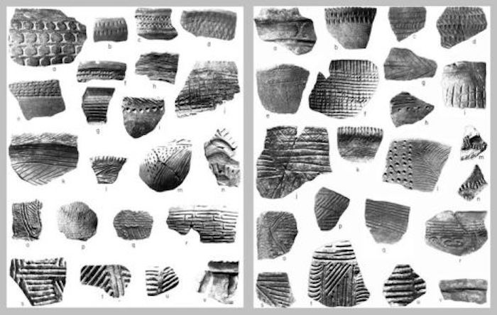
Valdivia pottery shards (left), Jomon pottery shards (right)
LO: One of these is a kimono that you couldn’t swatch, the whole thing seems unique to me.
KF: Yes, that is a Serigawa kimono; his work on silk has been a huge influence. I love how in the katazome technique the shapes are created with a stenciled resist paste, which allows for softer washes that have really abrupt edges. I like the feeling of a sharp cut happening right in the middle of a gradient.
LO: And for the stuff you did at Mission Road, you are painting on silk but what is interesting to me is thinking about how the silk might actually weigh a lot less than the physical paint that’s there. So it’s also like the silk is also like a very, very slight armature for a painting that’s almost all paint.
KF: That’s how it feels to me too. They are more paint than they are silk! The paint really transforms the silk so much, it no longer drapes especially when it gets several layers on there, it starts to act like straight paint.
LO: How are you putting it on?
KF: The first layer is a painted wash and there’s a lot of bleed.
LO: With a regular brush?
KF: Yeah, the first pass is a general wash on stretched silk. And then it’s taken off the stretchers.
LO: Is the first wash sizing it in a way? Because it’s stiffening it a little?
KF: It does stiffen it and keeps it from fraying so much. It all starts with white silk so the first wash is giving it a background color. From there I add more color through painting and through monoprinting. Because of the texture of the silk, it’s really hard to get clean lines without some kind of secondary substrate so I use monoprinting when I want the crisp, combed lines. Which show up most predominantly in the stairwell piece. Those kind of harder patterned lines kind of bring us into the third set, which revolve around a theme I call pattern interrupt. It’s a trend that I’ve been seeing in my own work and I see it in other people’s work, I see it in your work. It’s when a pattern intersects with another pattern with a sharp rupture creating a disjunctive connection. I’ve been seeing it and labeling that “pattern interrupt” which is a term from hypnotherapy that refers to when you interrupt someone who’s on the same old bad topic that’s bringing them down and you just suddenly say something to totally change the subject.
LO: Like, “Oh my gosh, is that a bee?”
KF: Yeah, I picked it up from my friend who’s a hypnotherapist. She introduced me to that idea and after that I kept seeing it in this really literal way. Patterns interrupting. So this first one is Stuart Davis and this one is a Bauhaus weaving design by Gunta Stölzl. She made the most amazing, colorful tapestries that have weird shapes that all kind of intersect that are really garish colors. This watercolor is muted but her work tends to be really bright, saturated colors. And this last one is a vintage Moroccan carpet.
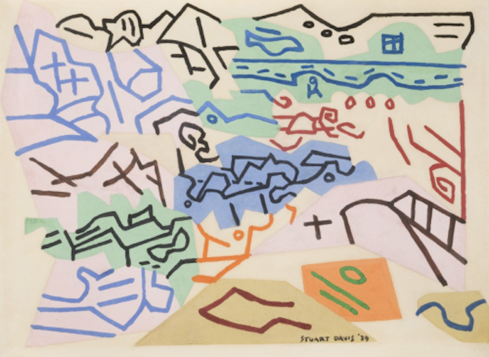
Stuart Davis, Bass Rocks #1, 1939, 8.75” x 12.25” Gouache on Paper

Gunta Stölzl, Watercolor weaving design

Vintage Moroccan Carpet
LO: What scale is that carpet?
KF: It doesn’t look like it’s that big, I don’t really know. There are not that many tassels, so it must be a small like a little prayer rug size. These images all do the pattern interrupt in different ways, in this one it’s a quilted, hard-edged juncture, and in this one these weird, cut shapes intersect.
LO: What’s interesting about all the ones you picked because if you just said pattern interrupt you would think it could just be this really disharmonious object of insane juxtaposition, but in the ones you picked, it always is as if some of the image almost is going to continue into the next collage piece but it’s slightly altered. So it’s not completely noisy.
KF: It’s more like out of phase.
LO: Yeah.
KF: And that’s what I was thinking a lot about when I was doing the stairwell piece, the way the different textures and patterns come up against each other, there are moments when the patterns go out of sync a little bit. It’s out of phase, but not all the time. In choosing these images I was trying to get at the idea that my relationship to collage is more about bringing things that are alike together. We normally think a collage is all about juxtaposition, disparate sources coming together into one image to create something that is disruptive, but in my work I’m looking for harmony between the elements.
LO: When I first got to know you really well we made a book together and books are like that where each page operates autonomously but they’re sequential, you get to know the book as a whole even though you want each page to work.
KF: That was especially tricky with mine because it’s an accordion that wants to be laid all the way out. So it was really composed as one that’s keeping the many in mind, but the spread still worked. But it was important that it could do both: the spreads had to work but it also had to flow like a scroll.
LO: And you were using all these really tiny brushes back then, because you were studying this Tibetan painting. What is that called?
KF: Tibetan Thangka painting. It’s the traditional Tibetan Buddhist iconographic painting.
LO: Is that usually done on paper?
KF: They do a lot preliminary work on paper but those are considered studies, the finished ones are done on kind of a muslin-y material that is sized and then gessoed and burnished.
LO: When you studied that, which was a while back, do you see how that influenced now?
KF: Definitely. Yeah, I think that the color ended up influencing me a lot. We learned how to make mineral paints and it’s a really hypnotic process. I had to do the azurite and the malachite, which are a bright blue and a green, and we also used cinnabar, which is this crazy mercury red. There’s a lot of staring into color when you are grinding it by hand. And color was never something I quite had figured out, as a printmaker I have always thought about color in terms of layers like they are sequential “plates”. The Tibetan color is very exuberant; it has this kind of bravado that has stuck with me. There’s a bravado to the whole thing, it’s kind of macho.
LO: The Thangka painting?
KF: Yeah, it’s more macho than any other kind of work that I’ve done. So it’s also left me with more confidence. It has a lot of swagger.
LO: Is it because you have to do something really spontaneously and really forcefully? How does it do that? Or is it just like accomplishment?
KF: I think it’s the spirit of my particular teacher, Pema Rinzin. You practice and you practice and you practice but then, ultimately you have to be willing to be spontaneous because the final marks on the painting are very fluid, calligraphic brush strokes that you just have to get right, there’s no do -over. You have to be confident and I think in the past my work was more restrained.
LO: It sounds like a really good way to train to be an abstract painter too because abstraction’s all about just the mark, you know?
KF: Yeah. And Pema makes contemporary abstract paintings as well as traditional thangkas, so we were all very engaged with abstraction the whole time I studied there.
LO: Yeah because before there were identifiable references in your work.
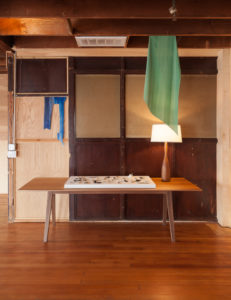
KF: Definitely. And there still are some, but they’re more far and few between. During the walk through I was pointing out some of the things that are representational. Like in the ceramics there’s a loom weight, and there’s a weird die. So there are imaginary game pieces and tools, things I consider representational. In the collages the same thing happens. There are representational things in there and I don’t resist that. The human urge to label everything: There’s some pants, a shoe, a sock. I embrace that labeling.
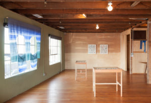
LO: One of the larger pieces that’s a drape, a curtain in front of the window, you had said it was an eye mask? I don’t remember how you referred to it.
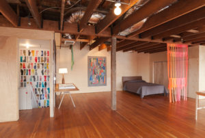
KF: Yeah, it’s a face but it’s also windows, all of those bigger silk things are architectural references. If you look out the window you can see how the fence outside is reflected in the gate piece near the bed. And if you look out the far back window you can see a ladder coming up to one of the industrial thingies.
LO: Maybe I thought eye mask because here’s the place you go to sleep, “nighty night.”
KF: Yeah! I was thinking of those shapes as arched windows but as soon as I cut them they were so clearly crying eyes.
LO: Oh yeah, weeping eyes. The weeper. I really like that one.
KF: Enter the weeper! (laughs) He just kind of showed up.
- Select Reviews


